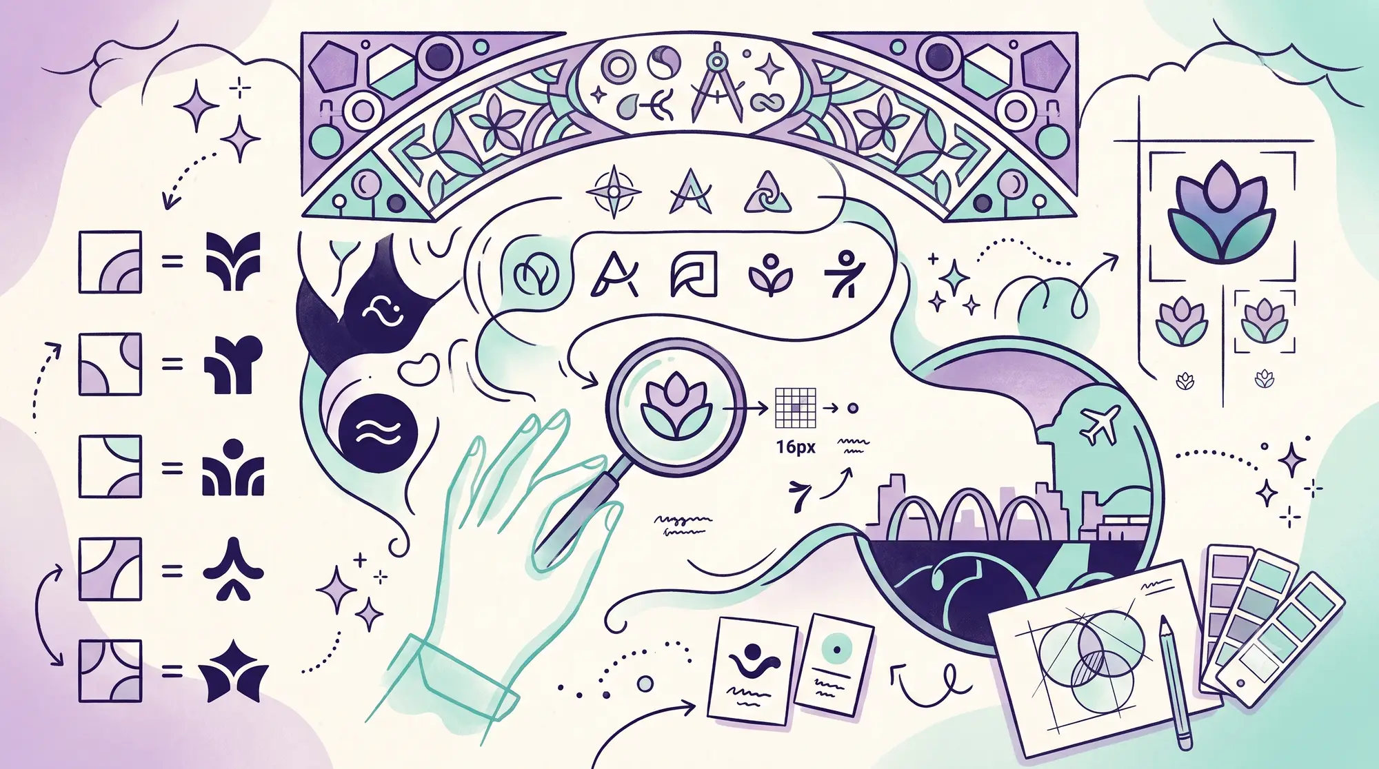

A good logo looks effortless, which is exactly why people underestimate how much work goes into one. The simplest marks, the ones you could draw from memory, are usually the hardest to get right.
I’ve designed brands for two decades, working with businesses across Luton among other places, and the logos that last all share the same handful of qualities. None of them are about being clever or trendy. They’re about being clear, useful and built to survive the real world. Here are the seven that matter most, and how to judge whether your own logo has them.
1. It’s Simple
The strongest logos are simple enough to recognise in a fraction of a second. Think of the marks you can picture right now with your eyes shut. They’re almost never complicated.
Simplicity isn’t about being boring. It’s about stripping a mark down to the one idea it needs, so it reads instantly and sticks in memory. If your logo needs explaining, or has three concepts fighting for attention, it’s doing too much.
2. It’s Memorable
Closely related, but not the same. A logo can be simple and still forgettable. The memorable ones have a hook: a distinctive shape, a clever bit of negative space, an unexpected detail that lodges in your head.
You don’t need to be flashy. You need one thing that makes someone go “oh, that’s the one with the…” A mark people can describe is a mark they remember.
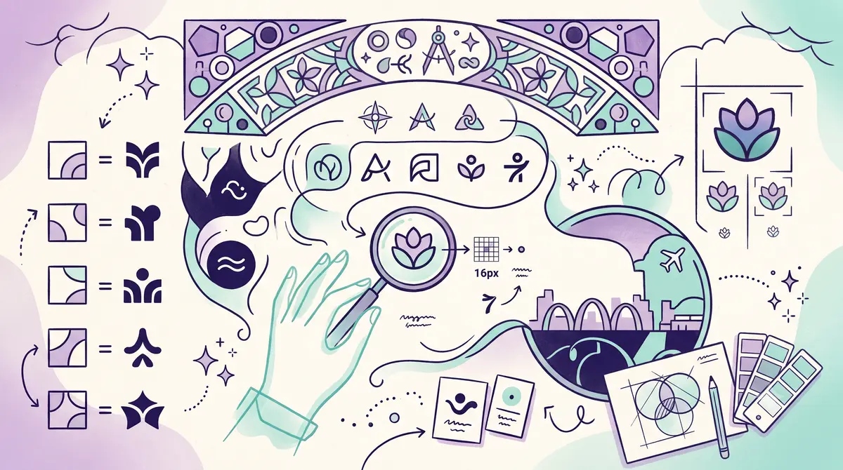
3. It Works Small
This is the test that kills most amateur logos. Your logo has to work at 16 pixels wide as a browser favicon, on a phone screen, embroidered on a shirt, stamped on a pen. If it turns to mush at small sizes, it’s not finished.
Fine detail, thin lines and tiny text all vanish when scaled down. A logo designed properly is checked at the smallest size it’ll ever appear, not just blown up large where everything looks good.
4. It’s Versatile
Your logo lives in a lot of places, and not all of them are ideal. It needs to work in full colour and in plain black and white. On a light background and a dark one. On a busy photo and a clean page. In print and on screen.
That’s why a proper logo project delivers a set of versions, not a single file. One colour, reversed, stacked, horizontal, whatever the situation needs. If you only have your logo as one PNG on a white square, you’ll hit a wall the first time you need it anywhere else.
5. It’s Timeless
Trends are tempting and they age badly. A logo built around whatever style is hot this year will look dated in three. The marks that endure lean on solid fundamentals rather than fashion.
This doesn’t mean dull. It means choosing forms and ideas that won’t embarrass you in a decade. You want a logo you grow into, not one you have to keep redoing. Speaking of which, a cheap logo redone every couple of years usually costs more than one good one that lasts.
6. It Suits the Business
A logo has to fit what it represents. A children’s nursery and a law firm need very different marks, and a logo that ignores that is a problem no matter how nicely it’s drawn.
The right tone, the right colours, the right level of formality, all of it should suit the business and speak to the people it’s for. A beautiful logo that sends the wrong signal is still the wrong logo. This is why I always start by understanding the business before I draw anything.
7. It’s Distinctive
Your logo’s job is to set you apart, so it can’t look like everyone else’s. This is the trap with stock icons and AI-generated marks: they pull from the same well, so you end up resembling your competitors instead of standing out.
A distinctive logo is drawn for your business specifically. It’s also worth a quick check that nobody else, especially a competitor nearby, is already using something close. Distinctiveness protects you legally as well as visually.
Why It Matters More in Luton
Luton has a genuinely crowded local market. Between the town centre, the retail parks, and a steady flow of passing trade off the back of the airport, there are a lot of businesses competing for the same attention on the same high streets. A logo that’s simple and distinctive isn’t a nice-to-have here, it’s how you get picked out of a row of shopfronts that all start to blur together.
There’s also a practical Luton-specific test worth running: does your logo work on the side of a van? Trade and service businesses covering Luton and the surrounding towns live and die by vehicle livery, and a mark with fine detail or a font that’s too thin turns to mush at motorway speed on a wing panel. If it doesn’t read clearly on a moving van, it won’t read clearly on a small social ad either.
How to Judge Your Own Logo
Run yours through a quick test:
- Could you sketch it from memory?
- Does it still read clearly at the size of a thumbnail?
- Do you have it in black, white and full colour?
- Will it still look right in five years?
- Does it feel like your business, not a generic one?
- Could it be mistaken for a competitor’s?
If you stumbled on a few of those, your logo might be holding you back more than helping. That’s especially true for local businesses, where looking cheap quietly costs you sales.
The Mistakes I See Most Often
After 20 years of this, the same problems come up again and again. If you’re commissioning a logo, watch for these:
- Too much detail. Gradients, shadows, fine line work and tiny text all fall apart when the logo gets small or goes on something printed. Simpler survives.
- Following a trend. Whatever style is everywhere this year will date your logo fast. Pick fundamentals over fashion.
- A logo that’s really just a font. Typing your name in a nice typeface isn’t a logo, it’s a wordmark anyone could recreate. There’s nothing distinctive to own.
- Only having one file. If all you’ve got is a JPG off your old website, you’re stuck the moment you need it on a dark background, in print, or at large size.
- Designing in isolation. A logo made without thinking about the business, the customers and the competition is a guess. The good ones come from understanding all three first.
What You Should Actually Get
A proper logo project doesn’t end with one image. You should walk away with a kit: the main logo, a stacked and a horizontal version, a one-colour version, a reversed version for dark backgrounds, a favicon for your website, and the master vector files so it can be recreated at any size forever. If a designer hands you a single PNG and calls it done, you’ll be back within a year. Knowing this also helps you judge a quote, which I broke down in what logo design costs.
Getting It Right
A logo that ticks all seven boxes doesn’t happen by accident, and it doesn’t come out of a template. It comes from understanding the business first, then designing deliberately for how the mark will really be used.
If you’re a business in Luton, or nearby in Dunstable or St Albans, and your logo isn’t pulling its weight, I can help. Take a look at my logo and branding service, or send me a message and tell me what you’re working on. The first chat and quote are free with no obligation, and I reply within a day. You can also email me at me@louislantos.com or call 01582 206160.