

Leaflets get a bad reputation, usually from people who’ve only ever made bad ones. Done properly, a flyer is one of the cheapest ways for a local business to put a real offer in front of real people nearby. Done badly, it’s a quid each straight into the recycling.
I design print work for businesses across St Albans, and leaflets come up constantly because they still pull for local trades, shops, salons, gyms, takeaways, you name it. The difference between one that works and one that gets binned in two seconds is almost entirely the design. Here’s how to get it right.
A Flyer Has One Job
The biggest mistake by a mile is trying to make a leaflet do everything. Your full service list, your history, five offers, your life story. The result says nothing because it’s saying too much.
A good flyer has one job. One offer, one message, one thing you want the reader to do. Before any design starts, you should be able to finish this sentence: “I want the person holding this to ______.” Book a table. Call for a quote. Come to the opening. Use this discount code. If you can’t say it in one line, the flyer isn’t ready to design yet.
The Two-Second Test
People sort post and flyers over the bin. You get about two seconds to earn the third second. In that flash, three things need to land:
- What is this? Clear at a glance, from the headline and the main image.
- What’s in it for me? The benefit or offer, not a feature list.
- What do I do now? One obvious next step.
Everything on the flyer should serve one of those three. If an element isn’t helping with what it is, what’s in it for them, or what to do next, it’s clutter and it’s working against you.
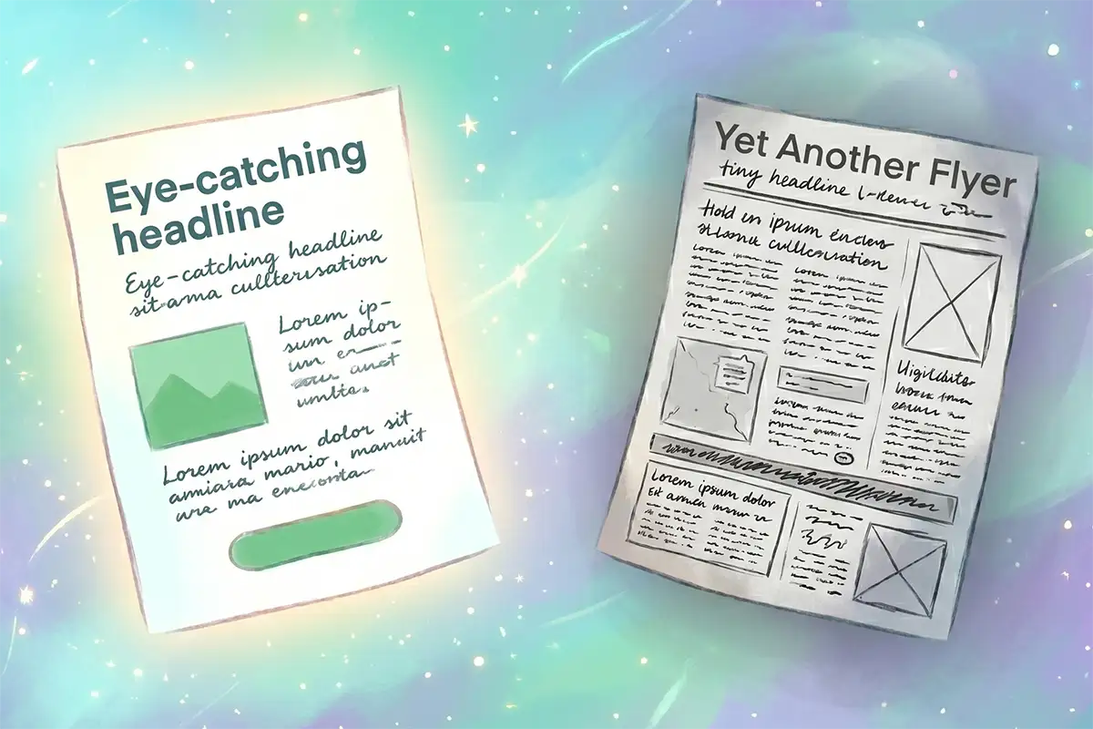
What a Good Flyer Gets Right
The leaflets that actually pull tend to share the same handful of things.
A headline that leads with the benefit. Not “Welcome to our salon.” Something the reader cares about: “20% off your first cut this month.” The headline does most of the work, so it gets the most space and the boldest type.
A single, clear offer. A reason to act now. A discount, a freebie, a deadline, a launch. “We exist” is not an offer. “Free consultation if you book before the end of June” is.
One obvious call to action. Tell them exactly what to do and make it easy. A big, readable phone number. A short web address. A QR code that goes straight to the right page. Bury the CTA and you waste everything above it.
Strong visual hierarchy. The eye should land on the headline, then the offer, then the call to action, in that order. That’s achieved with size, weight and spacing, not by making everything big. When everything shouts, nothing is heard.
Room to breathe. White space isn’t wasted space. A cramped flyer with text edge to edge feels cheap and is hard to read. Space around the important bits is what makes them stand out.
Good images, used sparingly. One strong, real photo beats five stock ones. Generic stock imagery makes you look like everyone else. A clear picture of your actual product, premises or work builds trust.
Brand consistency. Same colours, font and logo as the rest of your business. The flyer, your sign, your website and your social ads should look related. That repetition is what builds recognition. The same principle runs through your online ads too, which I covered in what actually makes Facebook ads convert.
The Mistakes That Get Flyers Binned
After designing a lot of these, the same problems show up over and over:
- Wall-to-wall text. Nobody reads a flyer like a letter. Cut it to the bone.
- No offer. Without a reason to act, it’s just an announcement, and announcements get binned.
- No clear call to action, or three competing ones. Pick one.
- A phone number you need glasses to read. If the way to respond is hard to find, you’ve lost them.
- Cheap clip art and stretched photos. Instantly reads as amateur.
- Designing it in Word. It shows, every time. Proper design tools and print setup are part of why a professional flyer looks like one.
Sizes and Formats
Pick the format to fit the job and the budget. The common ones:
| Format | Size | Good for |
|---|---|---|
| A6 flyer | 105 × 148mm | Cheap, handout, door drop, high volume |
| A5 flyer | 148 × 210mm | The workhorse, room for an offer plus an image |
| DL leaflet | 99 × 210mm | Fits a standard envelope, racks well on a counter |
| A4 folded to DL | folds to 99 × 210mm | More to say, menus, multi-service businesses |
| A5 folded | folds to A6 | A little story to tell, before and after, steps |
Bigger and folded means more space but more cost, both to print and to post. For most local offers, a sharp single-sided A5 or A6 does the job.
Why Print Still Pulls in St Albans
St Albans has a genuine physical footfall advantage that a lot of towns don’t. Between the weekly market, the shops along St Peter’s Street and around the Cathedral, and a steady flow of day-trippers on top of residents, there are a lot of real people passing real racks and counters, not just scrolling a feed. A well-placed flyer on a counter near the market or in a cafe by the Cathedral gets seen by people who are already out, already spending, and already close enough to act on it.
That physical density also means competition for attention is fierce. St Albans has more independent shops and cafes per street than most towns its size, all trying to stand out on the same short stretch. A flyer that looks homemade disappears into that crowd. One that’s properly designed, with a clear offer and decent paper stock, is what actually gets picked up off the counter.
Print Quality Says Something Too
The paper matters more than people think. A flyer on flimsy, thin stock feels disposable and gets treated that way. A bit of weight and a decent finish makes the same design feel like it came from a business worth taking seriously. You don’t need the most expensive option, but the cheapest paper undercuts even a great design. It’s a small cost that changes the whole impression.
Design First, Then Distribution
How you get flyers out (a door drop to chosen postcodes, handing them out at a local event, a stack on the counter, an insert in the local paper) absolutely matters. But none of it works if the flyer itself gets ignored. Distribution puts it in their hands. Design decides what happens next.
The strongest local campaigns also pair print with digital, so the same offer and the same look reach people on the doormat and in the feed. Seeing you twice, in two places, builds the familiarity that gets people to act.
Get Flyers That Pay for Themselves
A well-designed leaflet is one of the best-value bits of marketing a local business can do. The trick is treating the design as the part that earns the return, not an afterthought to rush before printing.
If you run a business in St Albans, or nearby in Luton or Dunstable, and you want leaflets or flyers that get read instead of binned, I can help. Take a look at my print and ad design work, or tell me what you’re promoting and I’ll put together something that fits. The first chat and quote are free with no obligation, and I reply within a day. You can also email me at me@louislantos.com or call 01582 206160.